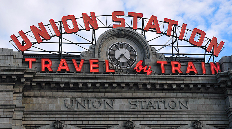


Denver Union Station looks up 17th Street from Winkoop.
Denver's Union Station has been modified considerably over the years � each version becoming more and more eclectic. The first version, and the most aesthetically pleasing one, was opened to the public on June 1, 1881. Unfortunately despite its limestone construction, it burned on March 18, 1894, the victim of an early electrical fire. The walls of the wings were preserved but the central portion was rebuilt using a Richardsonian Romanesque design executed in red sandstone and including a high clock tower. In 1914 the central section was again replaced, this time with an entirely different Beaux-Arts style central section, but it still retained the modified wings of the original building.
Still another rebuilding has been completed in 2014. The following is my (apparently minority) opinion of the latest renewal.
The stated intent was to preserve and revitalize the historic building and make it once again the transportation hub of Denver. In this, they have been mostly successful. The building has been preserved; externally, it retains the appearance of the third generation building. Inside and out it has received a much need cleaning and refurbishment. Once again the station is the hub of most non-automotive transportation in and out of the central city. Not only does it serve our two Amtrak trains a day but also buses and some of the new RTD rail routes -- notably the line to the airport -- yet to be opened.

Restoration of the overhead lighting is a major improvement.
Inside the central building, restoration of appropriate overhead lighting, very much like the original, is a stand out improvement. These fixtures replace dreadful fluorescent tube fixtures that were substituted for the originals years ago.
It isn't Union Station anymore! It is The Crawford Hotel. When you enter the building, visually you are entering the lobby of a hotel -- complete with a myriad of shops and restaurants.

Passenger arriving on the California Zephyr must be confused: Is this Union Station or is it the Crawford Hotel?
In the great hall, the familiar marble counters labeled "Tickets," "Pullman," "Telegraph," etc. have been replaced by the "Terminal Bar." Most of the hall is occupied by tasteless hotel furniture and odd, free-standing light standards. Two long shuffleboard tables obstruct foot traffic. In one corner of the great room is an inconspicuous Amtrak office. The ticket windows are actually tucked up a side passage. The familiar sturdy oak benches for waiting passengers are gone. These have been replaced by a much smaller number of more closely spaced, smaller, less substantial, substitutes along the trackside of the hotel lobby.
The exceedingly plain, white vaulted ceiling may or may not be authentic to the building of 1914, but it is way too plain and unadorned. A little thought could have made it impressive.

Amtrak's ticket windows are tucked up a side passage from the Great Hall.
Let me add that the Crawford Hotel was named in honor of Dana Crawford, a woman who, more than anyone else, has been the vanguard for "historic reuse" of Denver's worthy older buildings beginning with "Larimer Square." She started when "urban renewal" was still the urban planner's catch phrase. Ms. Crawford was involved with the redevelopment of the station building and with many other laudable Denver projects. The honor is well deserved, and having a hotel in the station is probably a good idea also. What is distasteful is having the station's very reason for existence tucked nearly out of sight in a corner of a hotel lobby.
Denver Union Station was designed to have two facades: one to put forward the best face to greet arriving passengers, the other to put forward the best face to departing passengers -- the grand entrance or exit of a proud city. Three generations of designers created serious, dignified, pleasing facades for this purpose. The grand old building still accomplishes this function today -- at least from the street side.
What is that thing?

Union Station now has a good side (street side) and a bad side (track side).
On the track-side, outside the station is a great, hulking, eye catchingly white plastic thing spanning the tracks. Visually it mimics both a Ringling Brother's big top and a train shed, both designed to protect people from rain, wind, snow and sun. But it cannot do this: it has an enormous hole in the top. Presumably it was inspired by the very modern architecture of Jeperson Terminal at Denver International Airport: a white, tent-like structure at the far end of RTD's new track (which does fulfill that function).

Discordant: The Great White Folly clashes with and diminishes the station's historic character and grandeur.
Officially it is named the "Great Train Hall"; I prefer to call it the Great White Folly (folly, noun: a costly ornamental building with no practical purpose). It performs no practical purpose, therefore it must be "art," perhaps intended to be viewed as light hearted humor, but instead it is a clashing affront to the western facade of one of Denver's most significant historical buildings.

The old umbrella sheds were simple but effective.
Once again architectural eclecticism runs amuck in Denver.
No access to the south

These tracks can never go south again.
From the opening in 1881, trains departed Union Station to Colorado Springs and other points south, east and west. Oddly in the grand plan, heavy rail and light rail routes to the south have been omitted. Now, all around the station, tall utilitarian but unsightly buildings are being built. Not only do these buildings obstruct the view of DUS, but some of them actually block any possibility of ever restoring tracks to the south. It can never be a through station again as was always the intent. As implied by the "Terminal Bar" inside, this building is no longer a station; it is a terminal -- or perhaps actually a hotel.